Svelte is a lightning-fast alternative to tools such as React, Vue and Angular. It can be used to build rich user interfaces, or — with SvelteKit — whole sites or apps, optionally including server-side rendering (SSR).
Another area where Svelte excels is for creating vanilla web components. Wether they'e interactive (e.g. a rich text editor), dynamic (e.g. a customisable navigation bar) or merely decorative (e.g. a card), web components allow you to define your own HTML tags to add additional functionality to pretty much any site or app, whatever technology it uses. All you need to do is include the relevant JavaScript.
Creating web components requires a little bit of configuration, so in this post I'll demonstrate the process by walking through an example web component.
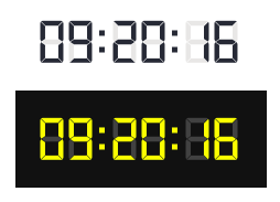
I'll be building a small "retro" digital clock, illustrated below:
After digging around for a while, during which time I found a number of online resources which were out-of-date, I eventually came across this to use as a starting point. It provides all the necessary dependencies, a Vite configuration for development and a build script specifically designed to generate web components that can be integrated with any sort of website/web application.
Installation and Setup
I'm using the degit package to scaffold the project; this is similar to a git clone except that it only copies down the latest branch, ignoring the Git history.
(Alternatively, the full source code is available on Github.)
Here's the command:
npx degit https://github.com/dariuszsikorski/svelte-webcomponent digital-clock
Inside the digital-clock folder, you should see the following:
├── LICENSE
├── README.md
├── index.html
├── package-lock.json
├── package.json
├── public
│   └── vite.svg
├── src
│   ├── App.svelte
│   ├── app.css
│   ├── assets
│   │   └── svelte.svg
│   ├── global.d.ts
│   ├── lib
│   │   └── Counter.svelte
│   ├── main.ts
│   ├── vite-env.d.ts
│   └── wc
│       ├── MyComponent.wc.svelte
│       └── web-components.ts
├── svelte.config.js
├── tsconfig.app.json
├── tsconfig.json
├── tsconfig.node.json
└── vite.config.ts
There are quite a lot of files there, though most of them we don't need to touch; and indeed, some are redundant.
You shouldn't need to touch main.js; its job is simply to mount the application component that gets rendered in the browser during development; that's defined in App.svelte.
You can launch this in a browser — with hot reloading — with the following command:
npm run dev
In order to define a web component and include it as a custom element in the resulting build, you need to do the following:
- Create it as a file with the extension
.wc.svelteinsrc/wc - Use the
customElementoption to define the tag used to embed it - Import it into
src/web-components.ts - Export it from that same file
We'll go through all four steps with a real example shortly.
Let's take a quick look at the Vite configuration, focussing on the options that are particularly relevant to creating web components.
Take a look at the below:
// vite.config.js
export default defineConfig(({ command }) => {
  if (command === 'build') {
    return {
      plugins: [
        // Process normal Svelte files (exclude .wc.svelte files)
        svelte({
          exclude: '**/*.wc.svelte'
        }),
        // Process web component files (only include .wc.svelte files) and compile them as custom elements
        svelte({
          include: '**/*.wc.svelte',
          compilerOptions: {
            customElement: true
          }
        }),
    // ...
What this indicates is that files with the .wc.svelte extension should be treated as custom elements; web components, in other words. It also allows for "normal" Svelte components without the .wc.svelte extension; these live in the src/lib folder and will act as dependents of the web components; that's to say, they're not designed to be exported as standalone components.
This snippet configures the build:
build: {
  lib: {
    // Use the web component registration file as the library entry point
    entry: resolve(__dirname, 'src/wc/web-components.ts'),
    name: 'MyWebComponents',
    fileName: (format) => `my-web-components.${format}.js`,
    // Build both ES and UMD formats
    formats: ['es', 'umd']
  },
This indicates that the build will reference src/wc/web-components.ts — essentially, including anything that that file exports — and create two output files; one using ES and one UMD. These will be named as follows:
dist/my-web-components.es.jsdist/my-web-components.umd.js
The package includes an example component, so let's start by removing that. Begin by clearing out the reference to src/wc/MyComponent.wc.svelte in src/web-components.ts, to leave just this:
export {}
Now you can safely delete src/lib/Counter.svelte and src/wc/MyComponent.wc.svelte, along with src/assets/svelte.svg.
The Digit Component
Before we can build the clock, we need a component for an individual digit.
Create an empty file, src/lib/Digit.svelte. Remember, files in this directory won't be exported; we'll only use this digit component within the clock. Furthermore, the fact that it doesn't have the .wc.svelte extension means that it won't be built as a custom element, as per the Vite configuration above.
The digit is based on the following SVG:
<?xml version="1.0" encoding="UTF-8" standalone="no"?>
<svg
   version="1.1"
   id="svg1"
   width="180"
   height="320"
   viewBox="0 0 180.00001 320"
   xmlns="http://www.w3.org/2000/svg"
   xmlns:svg="http://www.w3.org/2000/svg">
  <defs
     id="defs1" />
  <g
     id="g1">
    <path
       id="path34"
       d="m 42.950207,281.78094 -29.212,29.21466 c 2.924,1.72667 6.324,2.73334 9.96666,2.73334 H 155.92354 c 3.57866,0 6.92533,-0.97067 9.816,-2.64134 L 136.43287,281.78094 H 42.950207"
       style="fill:#e8e7e6;fill-opacity:1;fill-rule:nonzero;stroke:none;stroke-width:0.133333" />
    <path
       id="path35"
       d="m 40.499537,184.00894 -29.33067,-21.08133 c -4.35199,3.60533 -7.12399,9.04933 -7.12399,15.144 V 294.0676 c 0,5.788 2.51333,10.972 6.49066,14.57067 l 29.964,-29.964 v -94.66533"
       style="fill:#e8e7e6;fill-opacity:1;fill-rule:nonzero;stroke:none;stroke-width:0.133333" />
    <path
       id="path36"
       d="m 138.60487,42.850281 v 94.369329 l 27.59467,18.268 c 5.624,-3.46 9.384,-9.652 9.384,-16.73867 V 22.750281 c 0,-4.72134 -1.66534,-9.05067 -4.43867,-12.44 l -32.54,32.54"
       style="fill:#e8e7e6;fill-opacity:1;fill-rule:nonzero;stroke:none;stroke-width:0.133333" />
    <path
       id="path37"
       d="m 138.60487,278.39294 30.36,30.36 c 4.05333,-3.59734 6.61867,-8.836 6.61867,-14.68534 V 178.07161 c 0,-6.39467 -3.064,-12.05867 -7.79067,-15.648 l -29.188,21.79866 v 94.17067"
       style="fill:#e8e7e6;fill-opacity:1;fill-rule:nonzero;stroke:none;stroke-width:0.133333" />
    <path
       id="path38"
       d="M 136.35021,39.544941 168.36487,7.530281 C 164.9742,4.756941 160.6462,3.0902813 155.92354,3.0902813 H 23.704867 c -4.72,0 -9.05066,1.6666597 -12.44,4.4399997 l 32.01467,32.01466 h 93.070673"
       style="fill:#e8e7e6;fill-opacity:1;fill-rule:nonzero;stroke:none;stroke-width:0.133333" />
    <path
       id="path39"
       d="M 40.499537,42.324941 8.484867,10.310281 c -2.77333,3.38933 -4.43999,7.71866 -4.43999,12.44 V 138.74894 c 0,7.248 3.93199,13.56533 9.77066,16.97333 l 26.684,-18.408 V 42.324941"
       style="fill:#e8e7e6;fill-opacity:1;fill-rule:nonzero;stroke:none;stroke-width:0.133333" />
    <path
       id="path40"
       d="m 14.687537,160.61961 26.22133,-18.44534 h 97.696003 l 25.552,17.59067 -25.552,19.388 H 40.499537 l -25.812,-18.53333"
       style="fill:#e8e7e6;fill-opacity:1;fill-rule:nonzero;stroke:none;stroke-width:0.133333" />
  </g>
</svg>
Each path represents a segment, and I've named them like this:
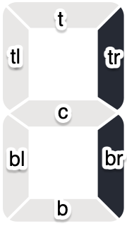
tl refers to top left, t to top, c to the centre segment and so on.
For clarity, I re-ordered the paths to go in a clockwise direction and added classes to match the labels above. I also removed the inline styles — those are going to get moved to CSS. Here's one of them:
<path
  d="M 40.499537,42.324941 8.484867,10.310281 c -2.77333,3.38933 -4.43999,7.71866 -4.43999,12.44 V 138.74894 c 0,7.248 3.93199,13.56533 9.77066,16.97333 l 26.684,-18.408 V 42.324941"
  class="tl" />
By adding a <style> tag to a Svelte component, you can define CSS styles that are isolated to the component in question. Let's add those now, to the bottom of the file:
<style>
.digit {
    width: 24px;
    height: 40px;
    display: flex;
}
path {
    fill-opacity:1;
    fill-rule:nonzero;
    stroke:none;
    stroke-width:0.133333;
    fill: var(--digital-clock-off-color, #e8e7e6);
    transition: fill 250ms;
}
.on {
    fill:var(--digital-clock-on-color, #262a34);
}
svg {
    width: 20px;
    height: auto;
}
</style>
.digit refers to a wrapper we're going to define shortly, and most of the CSS properties for the path element are the ones that were specified inline for each path individually.
I've added an on class; this indicates a segment is illuminated; thus, the colour changes. The colours are defined as CSS variables, with defaults.
Including a transition on the path's fill property will implement an animation whenever the number changes.
Now we need to determine which segments are illuminated, and in order to do that we first need to determine which number to display. We get that from the component properties:
<script>
  let { number } = $props();
</script>
I'm creating a variable for each segment, named as per the image above. These are derived properties, and are defined as follows:
<script>
  let { number } = $props();
  let tl = $derived([0,4,5,6,8,9].includes(number)),
    t = $derived([0,2,3,5,6,7,8,9].includes(number)),
    tr = $derived([0,1,2,3,4,7,8,9].includes(number)),
    c = $derived([2,3,4,5,6,8,9].includes(number)),
    bl = $derived([0,2,6,8].includes(number)),
    b = $derived([0,2,3,5,6,8,9].includes(number)),
    br = $derived([0,1,3,4,5,6,7,8,9].includes(number));
</script>
The last thing we need to do is conditionally add the on class to the segments, according to whether the digit being displayed requires it to be illuminated:
<div class="digit">
  <svg>
    <path
      d="M 40.499537,42.324941 8.484867,10.310281 c -2.77333,3.38933 -4.43999,7.71866 -4.43999,12.44 V 138.74894 c 0,7.248 3.93199,13.56533 9.77066,16.97333 l 26.684,-18.408 V 42.324941"
      class="tl {tl ? 'on' : ''}" />
The Web Component
Now it's time to build the web component for the clock itself.
Create a new file, src/wc/DigitalClock.wc.svelte, and add the following script tag:
<script>
  import { SvelteDate } from "svelte/reactivity";
  import Digit from '../lib/Digit.svelte';
  let time = new SvelteDate();
  let hours = $derived(time.getHours());
  let minutes = $derived(time.getMinutes());
  let seconds = $derived(time.getSeconds());

  $effect(() => {
    const interval = setInterval(() => {
      time.setTime(Date.now());
    }, 1000);

    return () => {
      clearInterval(interval);
    };
  });
</script>
This creates a date object using Svelte's reactive SvelteDate class, then uses an $effect to create a ticker that ensures that it always represents the current time. Additionally it defines derived variables that represent the hours, minutes and seconds.
We need a separator, too; a colon, essentially. This will be included twice; rather than duplicate it, we can define a snippet:
{#snippet separator()}
<div class="separator">
  <svg
    width="40"
    height="300"
    viewBox="0 0 10.583333 79.375"
    version="1.1"
    id="svg1">
    <g>
        <rect
        id="rect1"
        width="9"
        height="9"
        x="0.91877002"
        y="20.704327" />
        <rect
        id="rect1-5"
        width="9"
        height="9"
        x="0.91877002"
        y="47.84948" />
    </g>
  </svg>
</div>
{/snippet}
We need to extract the digits from the hour/minute/second. The first one is the value divided by ten and then floored:
Math.floor(hours/10)
For the second, we can use the modulus:
hours % 10
Putting that together, we can define the HTML for the clock using the Digit component we defined previously:
<div class="clock">
  <Digit number={Math.floor(hours / 10)} />
  <Digit number={hours % 10} />
  {@render separator()}
  <Digit number={Math.floor(minutes / 10)} />
  <Digit number={minutes % 10} />
  {@render separator()}
  <Digit number={Math.floor(seconds / 10)} />
  <Digit number={seconds % 10} />
</div>
Some styling:
<style>
  .clock {
    display: flex;
  }
  .separator {
    width: 12px;
    display: flex;
  }
  .separator svg {
    width: 8px;
    height: 40px;
  }
  .separator svg rect {
    fill: var(--digital-clock-on-color, #262a34);
  }
</style>
The final thing we need to do is specify the tag name for the custom web component. Add the following to the top of the file:
<svelte:options customElement="digital-clock" />
Back to src/wc/web-components.ts now, and we need to create a reference to the new component. Replace the contents of the file with this:
import Clock from './DigitalClock.wc.svelte';

export { Clock }
This is going to ensure that when we run the build process, our new component gets included.
Next, open up src/App.svelte so we can see the new component in action in a dev environment:
<script lang="ts">
  import './wc/web-components'
</script>

<main>
  <div class="clock-container">
    <digital-clock/>
  </div>

  <div class="clock-container dark">
    <digital-clock
      style:--digital-clock-off-color="rgba(255,255,255,0.2"
      style:--digital-clock-on-color="yellow"></digital-clock>
  </div>
</main>

<style>
  .clock-container {
    padding: 20px;
  }
  .clock-container.dark {
    background: #111;
  }
</style>
This creates two versions, somewhat akin to light and dark mode. Note how in the "dark" version, we can inject the on/off colours by setting the relevant CSS variables using the style: tag.
All being well, providing you've run npm run dev you should see the two clocks.
Now it's time to run the build process:
npm run build
All being well, this will generate two files:
dist/my-web-components.es.jsdist/my-web-components.umd.js
Trying it Out
Create a new folder with the following index.html file:
<!doctype html>
<html lang="en">
  <head>
    <meta charset="UTF-8" />
    <meta name="viewport" content="width=device-width, initial-scale=1.0" />
    <title>Digital Clock</title>
    <style>
      body {
        background: #222;
      }
      :root {
        --digital-clock-off-color: rgba(255,255,255,0.2);
        --digital-clock-on-color: yellow;
     }
    </style>
    <script type="module" src="./my-web-components.es.js"/>
  </head>
  <body>
    <main>
      <digital-clock/>
    </main>
  </body>
</html>
It's important to set the
typeon thescripttag tomodule; otherwise, it won't work.
Copy dist/my-web-components.es.js into the folder, and then launch it in a browser via your web server of choice.
Here's a simple way to do that:
npm install http-server -g
http-server .
Open up a browser to localhost:[PORT], and you should see the clock in action.
The full source code is available on Github.